Veron Doors
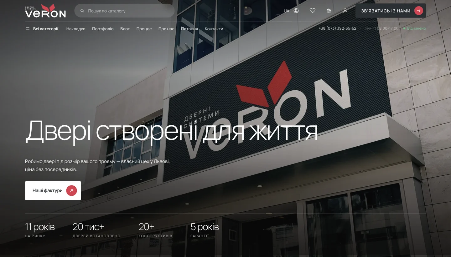
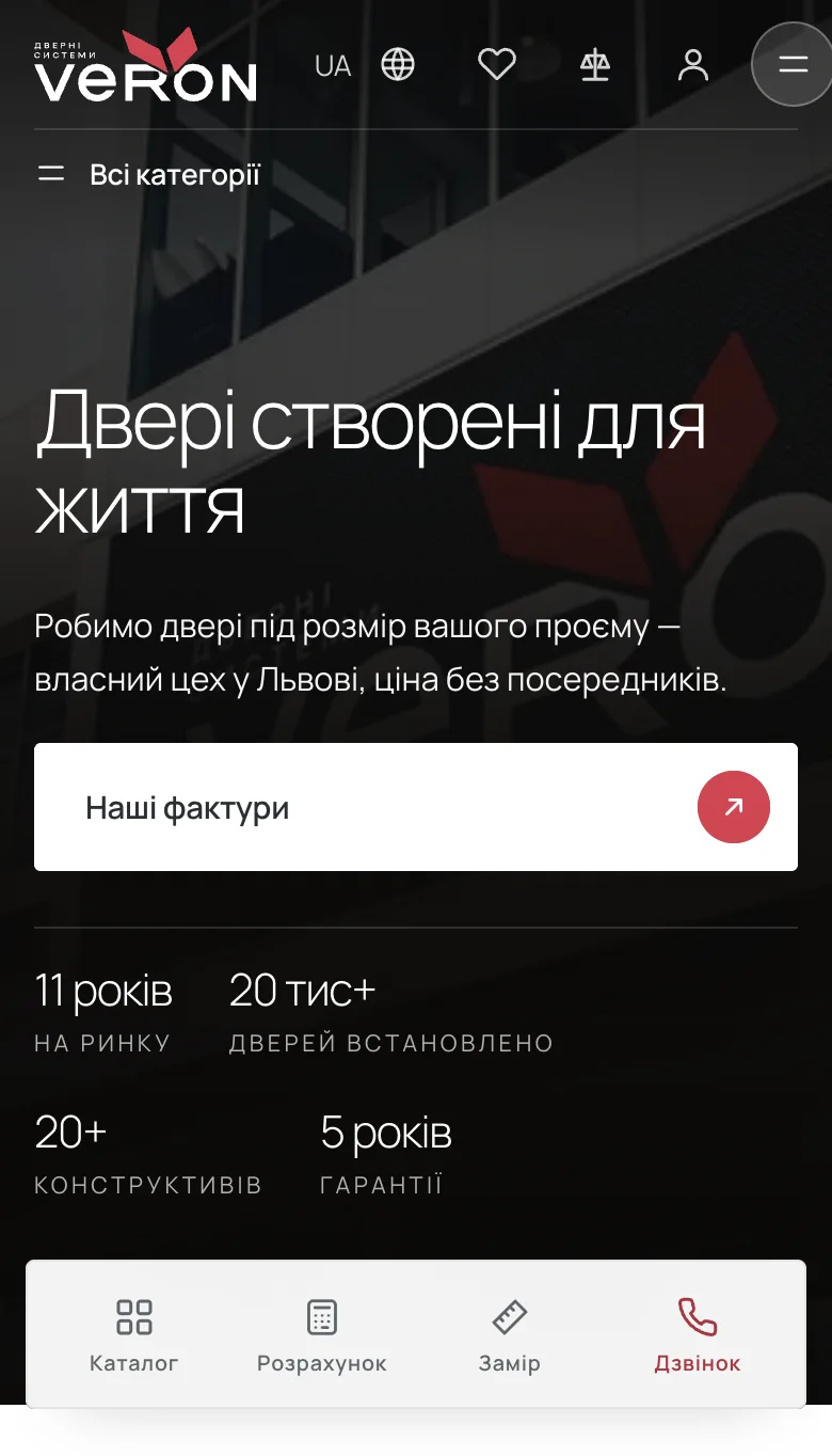
Redesign of doors-veron.com.ua for a Lviv door manufacturer. I did everything: catalogue UX, visual system, front-end, an admin panel for publishing projects, and the server launch.
- 01 — Project
- Veron Doors
- Role
- Product Designer & Developer — end to end
- Scope
- UX audit, Information architecture, UI & visual system, Front-end, Admin panel, Deployment
- Stack
- HTML, CSS, JavaScript, Ruby on Rails, PostgreSQL, Docker, Claude
02Context
Veron makes doors in Lviv and supplies residential developments. Architects, developers and private buyers browse the catalogue on the site before they call.
The brief: improve the logic and the look — home, catalogue and product page first, then tools so the team can keep the site current.
03Problem
The old site didn’t help people choose a door, and the team couldn’t update it without a developer.
- P1The catalogue on the old home page didn’t work, so visitors couldn’t reach the doors and enquiries were lost.
- P2The old site looked dated and was awkward to use on a phone.
- P3The team couldn’t add new projects to the site themselves: every change went through a developer.
04Research & discovery
Methods
- UX audit of the old site: walked through home, catalogue and product page and marked what works and what doesn’t; saved screenshots as the “before” and measured speed in Google PageSpeed (phone: 52 out of 100)
- Competitor analysis: looked at other door manufacturers’ sites to see how they build the catalogue, show prices and present real projects
- Conversations with the Veron team: who works with the site, what gets in the way and what still has to go through a developer
- Business goals agreed with the team: more enquiries without a call to a manager, real projects as proof, and updates without a developer
What I found
- The catalogue block on the old home page was broken, and this was where the site lost the most enquiries.
- Buyers want to see the price right away, without calling a manager.
- Competitors’ catalogues rarely let you compare designs of one model side by side.
- The team’s main pain is that every update needs a developer, so new projects reach the site late or not at all.
05UX
Information architecture
Core flow
- 01Land
- 02Browse catalogue
- 03Filter by type, price and series
- 04Product page
- 05See it in real projects
- 06Order or book a measurement
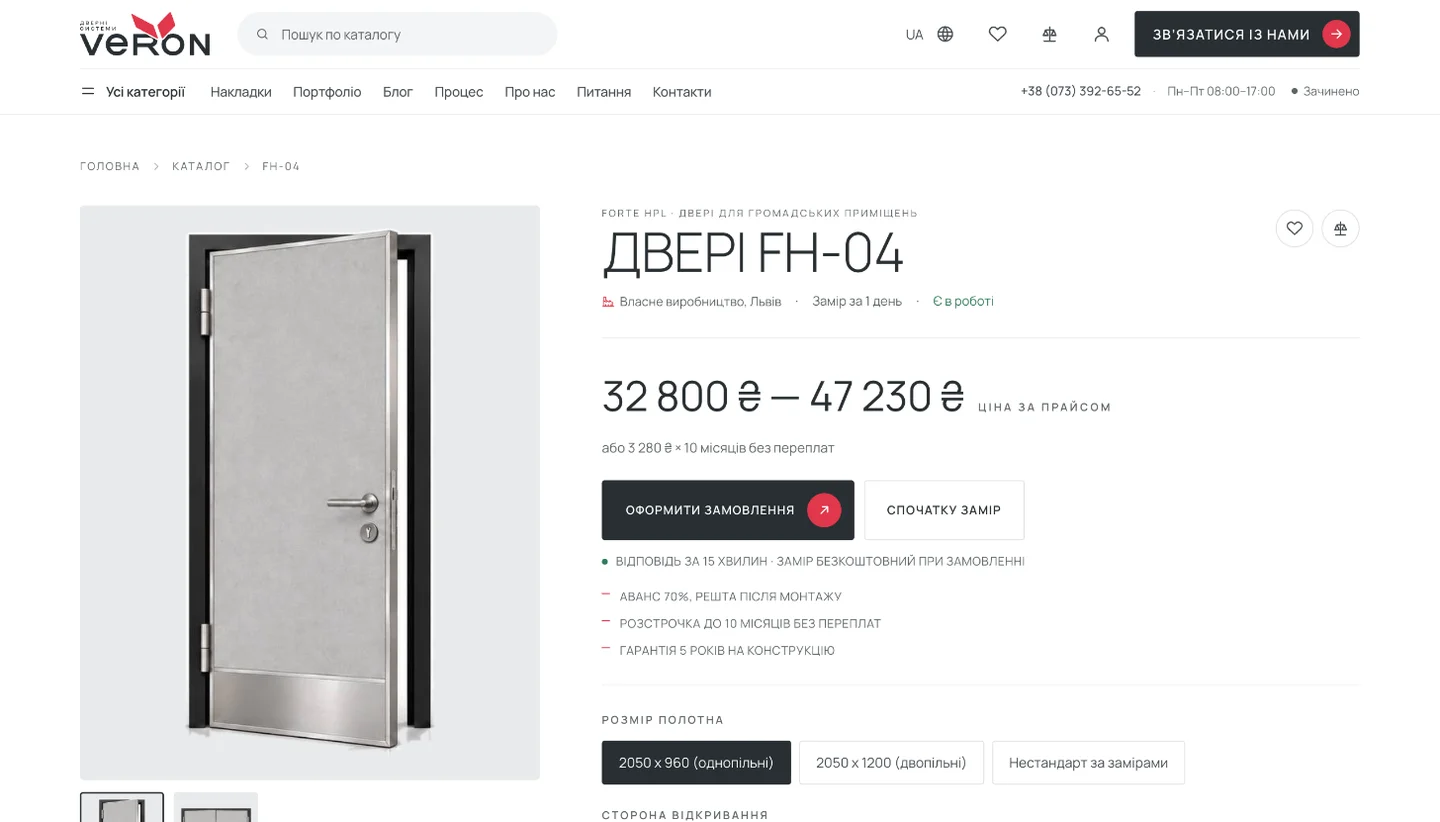
- A portfolio of real projects is part of the buying path: proof the doors are installed at scale.
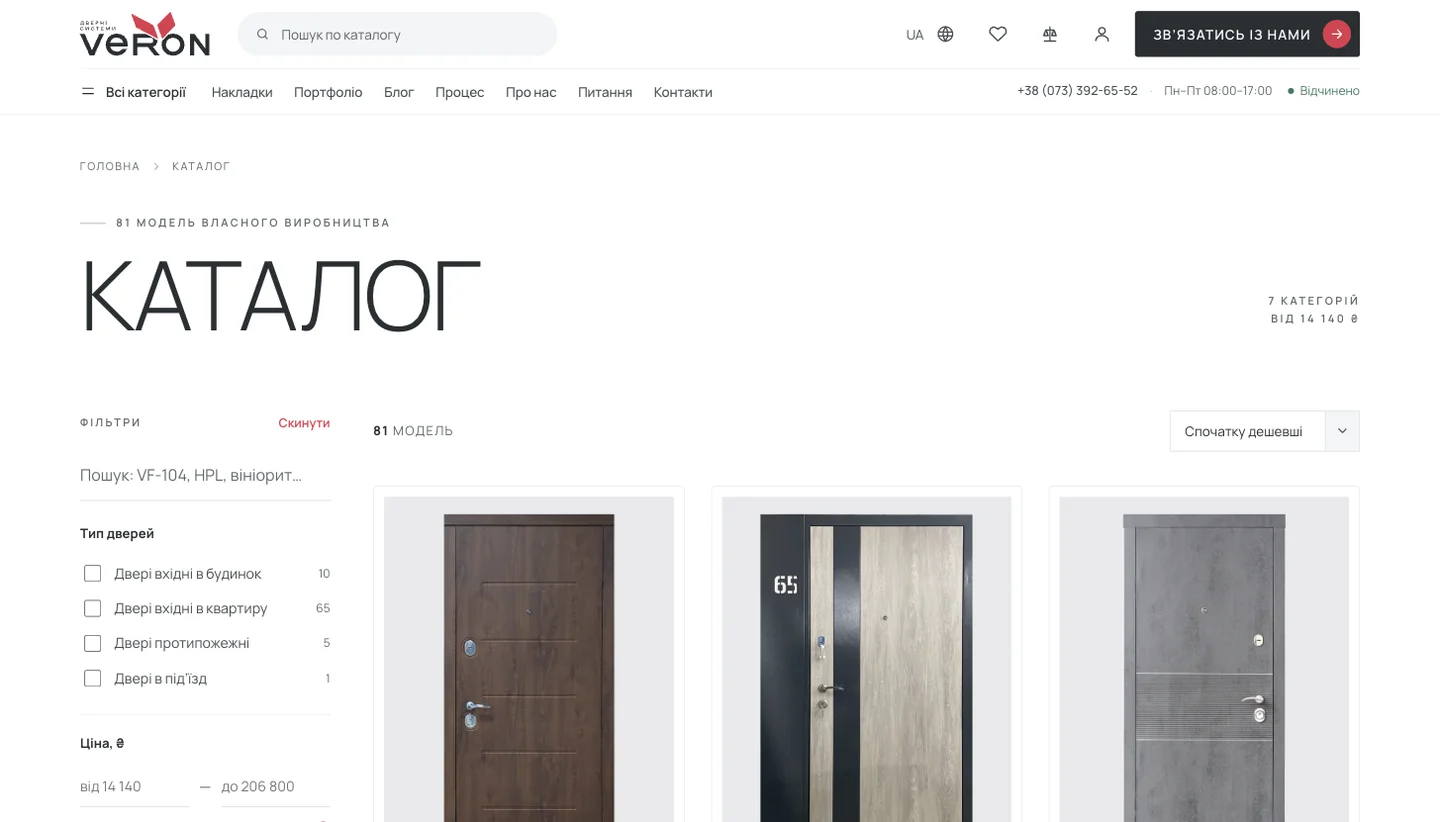
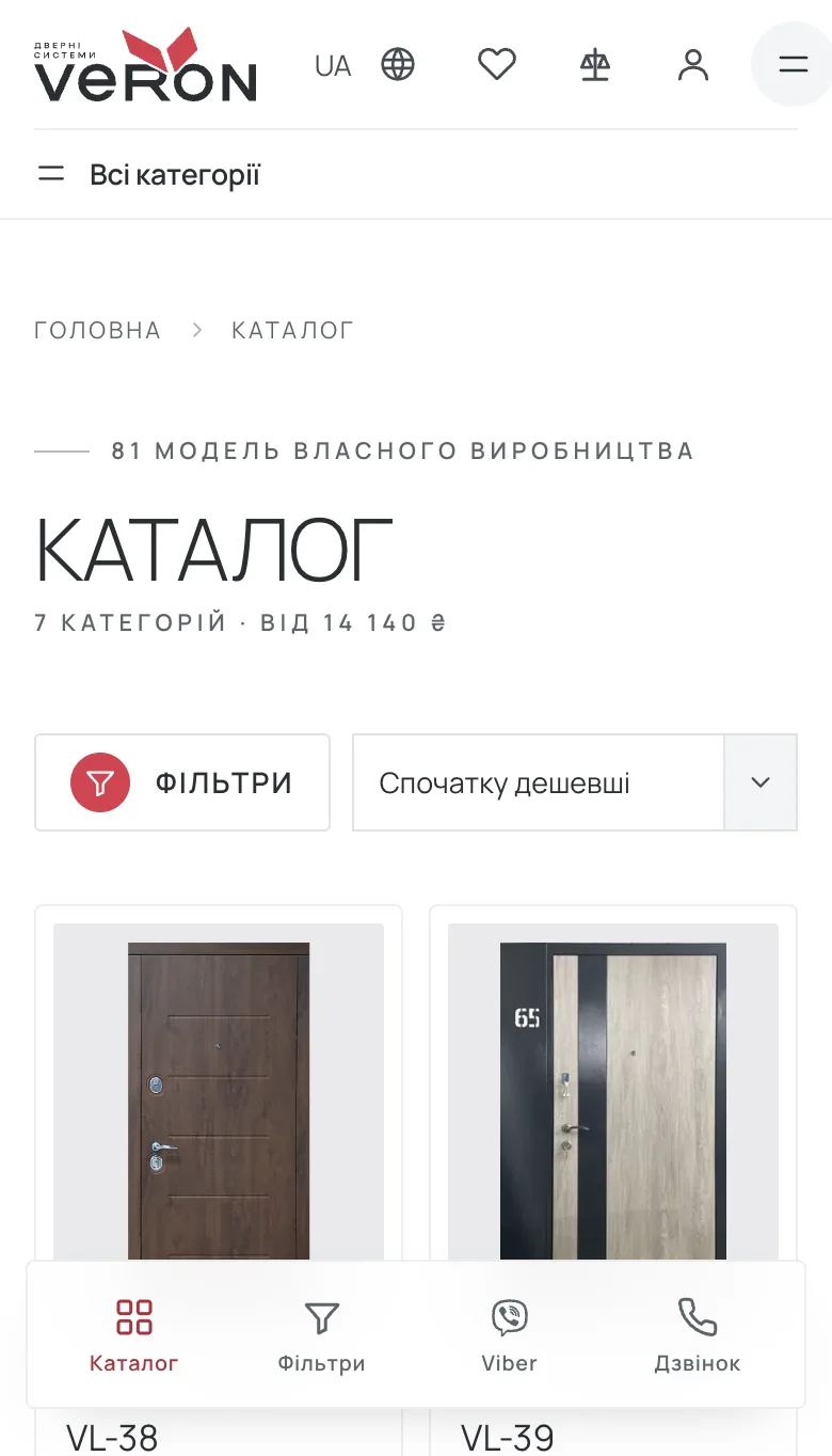
- The catalogue is split into 7 categories with filters by type, price and series, so you reach the right door in two or three clicks.
Key decisions
D1A publishing tool instead of a static page
- Problem
- Finished projects are Veron’s best sales argument, but each update needed a developer.
- Decision
- A small admin panel where the team adds projects itself, instead of separate pages a developer edited each time.
- Why
- The site stays current after handover.
D2A catalogue that works from the home page
- Problem
- The catalogue on the old home page didn’t work, so visitors didn’t reach the doors and enquiries were lost.
- Decision
- A working catalogue reachable from the home page: categories, filters by type, price and series, and the price on every card.
- Why
- Visitors reach the right door faster and leave an enquiry.
06Design
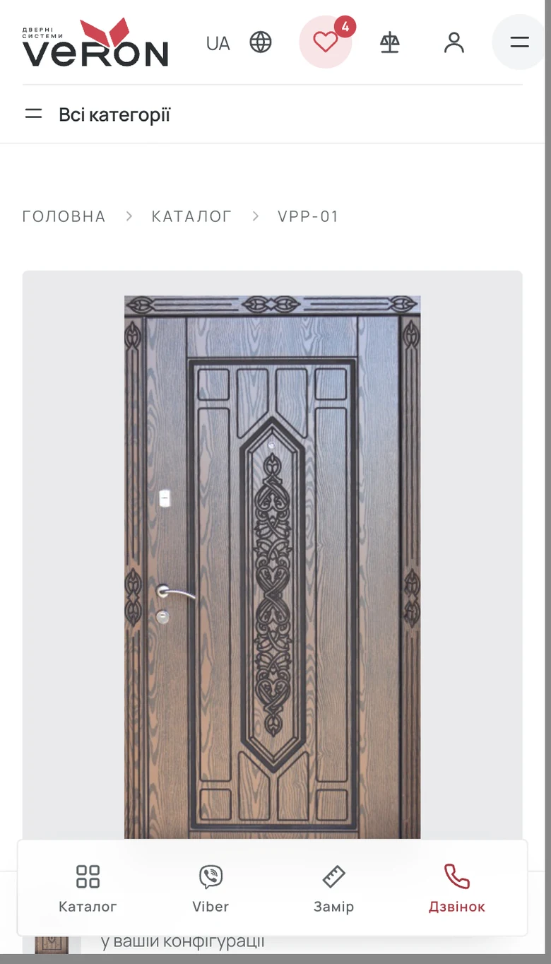
A light, restrained system: product photos and one red accent.
- Paper#FFFFFF
- Graphite#292F33
- Signal red#E0364C
- Radius2–4 px
- Pages designed straight in code as one component set.
- The catalogue shows the price range right on the card, so a buyer sees the cost without calling.
07Development
Designed and built by me
I built it myself, so there was no handoff.
- Front-end in HTML, CSS and JavaScript, written with Claude.
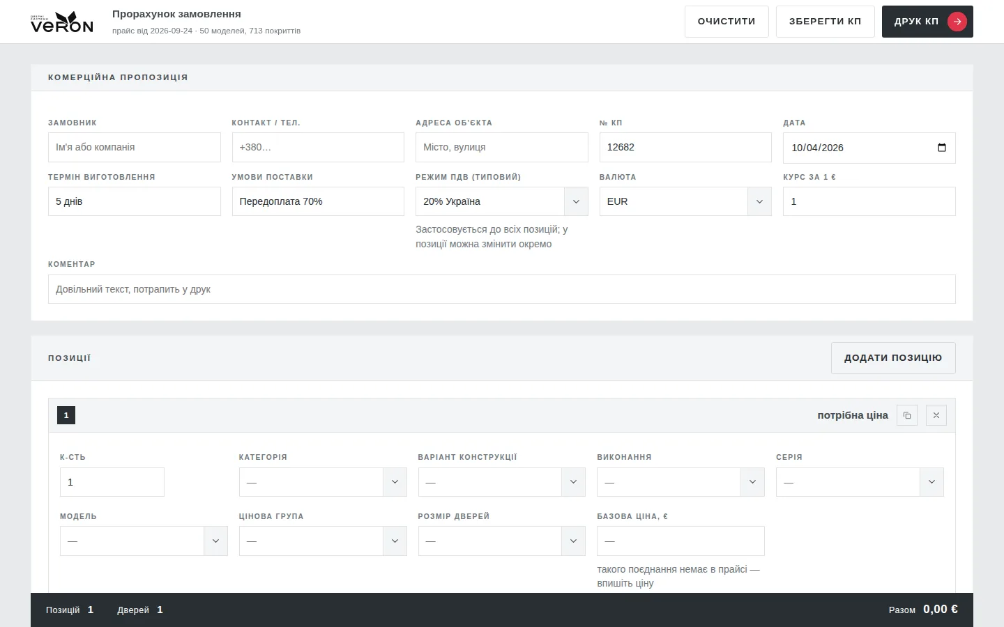
- Admin panel with a “Portfolio” module: the client adds projects (name, type, city, year, photos) without code.
- Server side on Ruby on Rails with a PostgreSQL database, packed in Docker and launched on the server.
- Google Search Console is connected to see how the site appears in search; Google Analytics 4 is next.
08Final product
09Outcome
- The site is live at doors-veron.com.ua.
- Delivered turnkey: design, development and launch.
- The catalogue holds 81 models in 7 categories, and the team publishes new projects through the admin panel without a developer.
- On the phone, the PageSpeed score went from 52 to 100.
- The working catalogue on the home page shortens the way to an enquiry: the visitor sees the models at once instead of searching for them across the site.
Google PageSpeed Insights, home page. Each score is 0–100, higher is better. Old site on the left, new one on the right.
- Performance
- How fast the page opens and becomes usable.
- Accessibility
- Whether everyone can use it: readable contrast, clear buttons, labels for screen readers.
- Best practices
- Whether the site is built safely and by modern rules.
- SEO
- Whether Google can understand what the page is about.
Phone


Computer


10Reflection
When I own everything from design to the server, I see right away where a design decision gets in the way of the build, and I can fix it on the spot instead of at a handoff.
That is why I fit into a team easily: I understand developers, speak their language, and design only what can really be built.